History of the logo. Logo «BMW», «Skoda», «Audi», «Toyota», «Adidas»: what is the history of creation
Agree, in the world of brands there are very few logos that everyone will recognize, learn through colorful advertising on television or colorful advertising posters hanging on the streets of the city.
How did the history of the "logo" begin?
The logo is a historically proven methodit is profitable to present the customer with his corporate style. We are accustomed to perceive any brand through a number of associations, which are mainly associated with famous slogans, advertising and recognizable sign.
At the sight of such branded symbols asCoca-Cola, three strips of Adidas, four Audi rings or two Toyota ovals, one immediately remembers the commercials that we see every day on television. In this list of well-known brands, the Apple logo has rightfully taken its place. We will learn how these personal images were created.
Yabloko from Apple

Probably, many are interested to know whathistory of the logo. The Apple logo was first created by Ronald Wayne. Unfortunately, this name does not tell us much, and in fact Wayne is the third founder of Apple, and also the great loser of the 20th century. Why the loser? Yes, because Ronald, 11 days after the official registration, sold his 10 percent stake in the company for only $ 800. Show Wayne with a little patience and a little bit of intuition, he would have certainly entered the Forbes list of the richest and most famous people on the planet with a fortune of $ 30 billion. However, Ronald simply did not believe that Apple was waiting for such a success.
Nevertheless, as the story of the logoApple, today's version has little to do with what was originally created. More precisely, almost nothing but an apple. But this was a whole work of art! In the picture of Wayne, a brilliant scientist Isaac Newton was depicted, who is about to fall an apple. This picture was truly magnificent, but not suited to the realities of modern business, so the idea of Ronald Wayne lasted only a year.
Then Steve Jobs (chairman of the board of directorsApple Corporation) turned to graphic designer Rob Yanov. Jobs needed a simple, modern-looking, well-recognized corporate image that would have a direct connection with the company's activities. Rob completed the task in about a week.
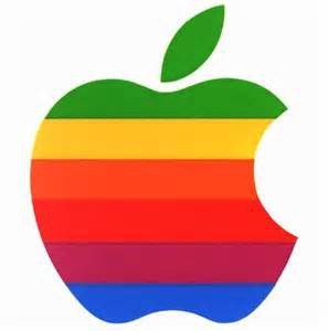
In one of the interviews, Janov described how heit succeeded. Rob bought apples and began drawing them, gradually getting rid of unnecessary details. He made a famous "nadkus" intentionally: it was necessary to depict the symbol of the company so that it was firmly associated with apples, and not generally with fruits, vegetables or berries. Rob Janov deliberately made the logo color.
This should reflect the fact thatthe company produces computers with color monitors, the display of which at that time could display six colors, which were present on the logo. Yanov put the colors in random order. In this form, as evidenced by the history of the Apple logo, the image of the brand existed for another 22 years.
However, in 1998, Jonathan Ive, designer,collaborated with Apple, came up with a new enclosure for the iMac G3. It became clear that the color logo on the colored poppy would look ridiculous. That's why, according to the history of the logo, the company's logo since 1998 and to this day looks like a laconic, monochrome symbol in the form of an apple with a black apple.
Winged emblem for "Skoda"
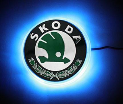
Who would have thought that the history of the logo "Skoda"began back in the late 19 th century, and most importantly, that everything began with bicycles and motorcycles! It would seem that with the manufacture of two-wheeled vehicles it would be difficult enough to move on to something more serious.
However, if you think carefully, then in the 18th centuryno one even suspected of such an interesting technique as a car. But it all happened! All bicycles and motorcycles of the company Slavia, which lasted about 10 years, were manufactured in the workshop, in the city of Mlada Boleslav. As the history of the Škoda logo says, the initial sketch of the emblem was a wheel whose circumference was framed by linden leaves, which were meant to symbolize the Slavic peoples, and just a year later the names of the company's founders were added here.
Thus, the mechanic Vaclav Laurin and the book seller Vaclav Klement laid the foundation for the magnificent company that we know now.
Colorful symbol for cars
Needless to say, at the beginning of the 20th centurythe company changed the name, but also turned the production of motorcycles and switched to cars? The company was named after its founders Laurin and Clement (L & K). The very design of the corporate cliche was due to the influence of modernity at the beginning of the 20th century. And only since 1926 the company began to bear a new name - ŠKODA. At that time, cars were produced at the plant in the city of Mlada Boleslav. Despite the change in the trademark, the form of the new logo reflected the connection with the previous version, but it was slightly modified. The logo with the already familiar "winged arrow" was first used in 1926. Commercial director of the company T.Maglich created a round blue-white field with a winged arrow that flew to the right. So, this version of symbolism lasted as much as 64 years. And only in 1999 he suffered a change. The black and green logo has given the ŠKODA brand a great originality. It exists to this day.

BMW with propeller
Very often, when it comes to the purity andblue-blue sky, it's not always the case with detergents and the like. Specifically, now we are talking about cars brand BMW. The history of the "BMW" logo began in the distant 1916 in Munich. It was then that two big companies merged into one so that in the future people could safely sit behind the wheel of a comfortable foreign car.
It's time to come up with an emblem for the company,which at that time produced aircraft engines. Beginning the development of the brand name from a rotating propeller, the company representatives decided that it was all too simple - and on the emblem appeared two colors that represent BMW so far - steel and blue of the sky. But the drawing was so bright and so severely cut the eye that it was decided that symbols should be added to the sign, namely - to connect the logo with the flag of Bavaria.
From that moment on, the emblem of BMW, already loved by all, could be seen a propeller, which now remains only in history, and colors that will always remind you of the origin of the company.
Three elements from Mercedes

Today "Mercedes" is not only a brandcar, it is also the long-standing reputation of the brand, which is associated with luxury and respectability. But we are interested in the history of the logo "Mercedes", which has reached our days.
So, the distant 1902, the appearance of such a hugecorporations like Mercedes. As you know, it was created by three parties, and the creators - the famous Wilhelm Maybach, Gottlieb Daimler and Emil Ellinek - constantly argued which emblem should represent their creations. No option inspired them with confidence. There were also offered carrots, and an orange, and even an elephant. Has solved dispute and almost quarrel between old friends and partners daughter Ellineka who very much loved cars. Moreover, it was in her honor that the now famous Mercedes was named.
Young Mercedes suggested not to argue and crosscanes, that is, reconcile among themselves. At speed, the creators came up with a slogan that exists today: the best quality in three dimensions - in water, in air and on land. The emblem of "Mercedes" can be deciphered in the same way - the merging of the three regions - as a true sign of quality.
History of the Audi logo
Four Audi rings, as well as other imagesfamous brands, envelops an impressive and interesting history of the logo. This logo is named after the founder of the automobile company August Horch. The matter is that in translation from German Horh means "listen", while in Latin it sounds like audi. Earlier, the founder of the company gave his offspring his own name "Horch". But over time he had to leave the company and create a new car concern. And the brand "Horch" was already occupied. I had to come up with a new name for the product. In 1928, during the economic crisis, the concern included four automobile companies: DKW and Wanderer, Horch and Audi. This merger of four auto plants was named Auto Union. That is, partners and competitors have united. And now the company's modern cars are decorated with four rings.

The way from Toyoda to Toyota
Automobile company Toyoda founded Japanesebusinessman Kiichiro Toyoda. When launching his first plant, he announced a contest for the company's best logo. The application, which consisted of letters of katakana in design, won.
These letters conveyed a sense of speed. The word "Toyoda" was renamed "Toyota", so it looked better in terms of design. Since then, the name has not changed.
History The logo of Toyota begins in October 1989. The emblem has not changed since then. It consists of three ovals. Two ovals located perpendicularly mean a tight connection between customers and the company. The intertwining of these ovals outline the letter "T" - the first letter in the name of the company. The background of the emblem symbolizes the global advantage of Toyota technology in the global automotive market. And in 2004 the logo became voluminous. This was evidence of the excellent quality of produced cars.

Three strips of Adidas
Adidas is one of the most famousfirms-manufacturers of sportswear and footwear. The company was founded in 1920 and received its name on behalf of the creator Adolphe (Adi) Dassler, from where the Adidas took. As the history of the Adidas logo shows, the first version of the company's logo was invented by Adolf Dassler himself, these were three strips that became recognizable on athletic shoes.

With Nike to win
There is not a person who is even a little interested inSports, which in our time does not know the company Nike. This company has established itself in the market, and its corporate logo depicting the movement, take-off, achievement of the set goals, today everyone knows.
According to the rules of American grammar, the namethe firm should be read as "Nike", not "Nike", as used in Russia. The company is named after the goddess of victory Nicky. The history of the logo deserves special attention.

"Nike" was "on the rise"
The logo of "Nike" founder of the company Vil Knight orderednot known designers, but a simple student, but was constantly dissatisfied with her options for drawing. The basis was taken of the wing of the goddess, a careless stroke, which in the original version emphasized the name of the company, so was rejected. The inscription was moved upward until they were removed at all. Over time, "Nike" began to recognize the company logo, and the name was unnecessary to indicate.
</ p>


